Tuesday, April 19, 2016

Mesh Tool

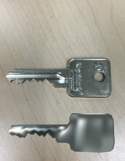
For this assignment, we were told to use the mesh tool in Illustrator to create a mirrored image of an object that we had in our room. We were told to take a picture of the object and then upload it into Illustrator. We then used a combination of the pen tool, direct selection tool, and eyedropper tool to make an exact copy using Illustrator of the original object. I found this project to be pretty challenging.

Although it was definitely time consuming, what I had a really had a hard time with was actually getting the correct color where they needed to be and correctly understanding the dimensions. Since the object I chose had so many different dimensions, I had a really hard time getting all of them down and I also struggled really hard with all the different areas of shadow and light on my object.The silver of my object was very reflective and therefore used multiple colors ranging from white to bright silver and back to very very dark gray. After spending quite a few hours on this project, I was pretty frustrated but was able to finish it and was pleased enough with the final product.

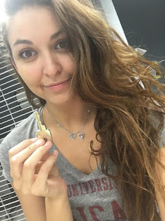
Selfie with Original Object:


Original Object/Mesh Object:

Monday, April 18, 2016

Business Cards

I was very nervous about this project as soon as it was assigned because I felt that working entirely with Illustrator in order to create business cards was not going to work well for me at all. Although I do feel that Illustrator is a lot easier to use than Photoshop, I still struggled with it and did not feel confident before doing this project. However, I ended up really really having a great time doing this assignment. It was the first time ever that I had gotten to sketch out an idea and then actually watch it come to life. Since I do not really have any artistic skill when it comes to hands on painting, drawing, etc. I soon was able to recognize Illustrator as an extremely useful tool as opposed to my worst enemy. These business cards actually ended up being a lot of fun to work on, although they were pretty time consuming.

Brainstorming Logos

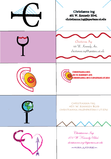
I was very excited to get to experiment with logos for class. Since my major is Advertising and Public Relations, I know how important logos are in the business world and to represent yourself and/or your organization. My client was my classmate Christianna Ing. For this assignment, we were told we needed to take our client's resume and discover five separate things about them that represented who they are and their interests. Once we had those five things, we were told to use them to create logos based upon those interests/ unique personality traits. I used what I gathered from her resume to create five sets of sketches. The following were selected to be the best ones out of the 25 originals created. Christianna's five interest were:

1. Leadership and Scholar

-This sketch came from leadership and scholar. The globe is meant to describe leadership, while also representing her excellence in education. The C is embedded in one side of the globe, while the I is in the pedestal of the globe.


2. Digital Arts and Graphics

-For her digital arts and graphics side, I had a very hard time choosing what would work best for her since that is quite difficult to portray. I ended up using a play on words. The C is a large outline of the letter, while inside of it there is an actual "eye" to represent the letter I.


3. Modern/Simple and Sophisticated/Cute

-I really had fun sketching a lot of different designs for modern/simple and sophisticated/cute. This one is one of my favorites because it is a wine glass with the letters inside the image. The C is on its side as the bottom of the wine glass, while the stem of the glass is actually the I in her name.


4. Charity Work

-For her charity work, I decided to go with a simple heart design that could double for sophisticated/cute as well. This design used a heart to represent charity while still using the C and the I of her name inside the heart itself.


5. Health and Fitness

- Although this design may not immediately resemble anything to do with health and fitness, it is a logo sketch that gives off an air of strength and endurance (similar to the lines of a bridge) that works well with this trait.



Calligram

For this assignment, I was really excited to create my own calligram because personally I love the way they look. I think calligrams are a unique way to show an image and convey meaning outside just the plain image. However, I had a pretty hard time understanding some of the tools we used in class and was pretty nervous about actually getting the assignment done. I chose a poem about the moon and stars because I think that in terms of powerful images, the sky (especially the moon/stars) are quite powerful and would be fun to do as a calligram. I would say the most challenging parts of this assignment was making the words fill the entire shape of the moon, because for some reason they did not want to fit into the edges. Another struggle I had with this assignment was making sure that all of the words fit into the desired shape and not letting them overflow. At the end I was pretty happy with my product and felt it was successful.

Original Image:


Calligram:

Then and Now: Blast from the Past (Morphx)

I had SO SO SO much fun with this project. I have always loved seeing pictures of people from when they were little kids to them in the exact same spot doing the exact same action years later as an adult. Besides finding it to be very interesting, I also think it is super cute to see. I loved the examples we looked at in class, and thought it would be really fun to do myself. However, I did struggle with this assignment. I had one picture I planned on using but realized that it was nearly impossible to get my face to be in the exact same spot as it had been so many years ago. I ended up using a different photo where my face was in a position that was easy enough to replicate. Afterwards, we were told to use the program Morphx to morph our faces from "then to now" and see the growth happen. Although at first I thought it looked a little creepy, I ended up really enjoying seeing the change and found it be pretty fun.

Original Image (age 7):


Image Photoshopped (age 20):


Morphx (from 7 to 20!):


Playing with Photoshop Types Part 2

As we continued to learn more about Photoshop, we also were told to keep on experimenting with the tools and filters. It was a lot of fun to see what would happen when you took off a single layer or multiple layers. I think what I honestly liked the best was the filters that could be applied. I thought it was interesting to learn that these filters came from people who spent so much time figuring out a filter to create for Photoshop. Applying effects was also really enjoyable just because it was so good to finally see for myself how much magazines and media can manipulate someone's face or body to look completely different. I liked learning about Photoshop because I enjoyed understanding that these images all over media were highly unrealistic and seeing the tools that went into them was more than just informative, it was enlightening.

Gif 1:

  In this first photo, I made only some slight changes with the layers.

Gif 2:

  In this second photo, I decided to eliminate most of my silhouette and have the primary focus be the hands. I really like this because with a simple manipulation of the layers, it changed the meaning of the photo entirely.

Gif 3:

  In the third photo, i wanted my silhouette to be there but not to be very filled in. I liked that only the darkest parts of my figure showed in this one.


Gif 4:

  This fourth photo is definitely my favorite because the layering change plus a filter was so fascinating as a result. Using the layer change and a filter made the whole thing look like it was drawn with colored pencils or with very light crayon, and I thought this was a really interesting look.


Gif 5:

  Since I liked the look of my fourth photo so much, I decided that I would try to keep the colored pencil look but keep my silhouette and see what kind of effect that would have on the overall picture. I liked it because it made my silhouette dark and the main focus, but I didn't end up liking it as much as the other one.


Playing with Photoshop Types

One of our assignments for class was to experiment with the different kinds of ways to edit an image on Photoshop. I used the same image multiple times using multiple distortions and filters, and was also able to see the difference in saving as a jpg versus gif, etc. Below is the work I did with that. What I noticed was that with the 0-50, the image could not retain as many of the colors or brightness. These images were also grainier and did not appear as clear. However, with the 75-100, the image retained most of its colors, was brighter, and much more clear without that unappealing graininess.

Image at 0.jpg:


Image at 25.jpg:


Image at 50.jpg:


Image at 75.jpg:


Image at 100.jpg:


Re-Coloring a Picture with Photoshop

This assignment was one of the first times we ever tried playing around with Photoshop. For me, the hardest part was trying to understand the opacity and how to correctly manage the eraser tool. I found that a lot of the time, my opacity was off and therefore the color was too bright and the contrast in the entire image was way too strong. I ended up having to re-do this assignment so that I could have an image that worked out decently. We were also told that before we could recolor the image, it had to be in black and white. After several attempts, I was finally able to finish up this assignment with a good image. It was also a lot of fun to see what I would look like with purple hair and blue eyes!

Original Image:


Image Re-Colored:

Art Project: Painting

This project was very interesting because I definitely thought it was difficult. I had a really hard time understanding the concept behind this whole assignment, but luckily I was able to figure it out. the hardest part of this assignment was actually trying to angle the photo correctly so that every aspect of my face was able to line up correctly with the painting. It was also very difficult to try to get the same graininess of the original painting. However, by the time we finished this project, I was pleased with the final result and had learned a lot from the process.

Original Painting (Girl with a Pearl Earring):


Re-Done Image (Liliana with a Pearl Earring):

A Night in Paris

This was one of my favorite assignments because we were able to Photoshop ourselves into any place we wanted in the world. I used a photo of my boyfriend and I and searched through dozens of google images until I found an image of the Eiffel Tower in black and white. I edited the photo of my boyfriend and I and transformed it into a black and white photo so that I was able to fit it in with the image of Paris. After that, it was all using Photoshop tools that we learned about in class (like the lasso tool) to make the image the way I wanted it to be. It was a lot of fun!

Original Image: 


Image in Paris:  

Autoscopy

For this assignment, we were told to explore Photoshop and all it has to offer through manipulating a self-portrait. Through using layer effects, exploring all the different kinds of tools you could use on Photoshop, and much more, we were able to completely change a portrait of ourselves into something different. I think this has definitely been one of my favorite assignments, because we got to explore our creative sides and relate the project to a personal problem we had. In regards to an issue from my life, I chose to focus on the feeling that I always have in the back of my mind and a feeling that has been a constant shadow all throughout college, which is the feeling of time slipping through my hands. No matter what, I never feel like I have the time to finish things and do what I need to do before I graduate and go on to the real world. I chose to explore that in my autoscopy.


Original Photo:


Autoscopy Version: